How much a dial really costs
Start with the disappointing part, because most articles on this subject skip it: on a Galaxy Watch, the choice of watch face is a modifier on your screen-on time, not a category of drain in its own right. The things that actually empty the battery are how long the screen is lit, GPS, an LTE connection, and sensors kept running continuously. The dial sits underneath the first of those.
That makes the honest claim a modest one. Switching from the brightest, busiest, animated face in a catalogue to the darkest, sparsest, static one is worth a few per cent of a day for most people — noticeable if you are already finishing the day at 8%, invisible if you charge every night regardless. Anyone promising an extra day from a dial is describing something else, usually always-on display, which is covered below and which genuinely is that big.
The ranking, shortest version. Turning always-on display off saves the most by a wide margin. Choosing a dark, static face saves a little. Choosing a face with fewer polling complications saves a little more. Everything else is noise.
Why black is different on OLED
Every Wear OS Galaxy Watch uses an OLED panel, and that one fact is behind all of this. In an OLED display each pixel makes its own light. There is no backlight behind the screen that is either on or off for the whole panel — a pixel showing black is simply not emitting, and draws very close to nothing.
So the power a dial costs is roughly a question of how many pixels it lights and how brightly. A face that fills the screen with a pale photograph lights essentially every pixel. A face that is black with a thin ring and four markers lights perhaps a few per cent of them. This is why "dark mode saves battery" is true on a watch in a way it is not on an older LCD laptop, where the backlight burns the same either way.
Two smaller effects ride along with this. Brightness is multiplicative: the same face at maximum brightness costs substantially more than at automatic, and raising brightness is a bigger change than swapping faces. And on most OLED panels the blue subpixel is the least efficient of the three, so a large area of saturated blue or white costs a little more than the same area in a warmer colour. That second one is real but small — small enough that it should never be the reason you pick a face you like less.
Screen size is part of this too, and it is the one variable you cannot change after buying the watch. A 47 mm Watch Ultra has substantially more panel to light than a 40 mm Watch 6, so the same bright dial costs more on the bigger watch in absolute terms. It also has a much larger battery, which is why the bigger models still tend to last longer. The practical read is that a dark, sparse dial pays off slightly more on a large watch than a small one — not that a large watch is worse.
The four things that matter
Everything above reduces to four properties you can judge from a preview, in descending order of how much they cost.
1. Is it animated? This is the biggest of the four by a distance. Animation keeps the display refreshing and the processor busy while the watch would otherwise be idle, and unlike the rest it costs power in the moments you are not looking. A static dial with identical colours is cheaper than an animated one, always.
2. How much of the dial is lit? The area question from above. A black background with thin elements on it is the cheap end; a full-bleed photograph or a bright gradient is the expensive end. Judge it by squinting at the preview — the proportion of the circle that is not black is roughly the proportion of the panel that is working.
3. How bright are the lit parts? A hairline ring in mid-grey costs less than the same ring in pure white. Faces described as having a single accent colour on black are usually designed exactly this way.
4. What do its complications do? Covered in its own section below, because the difference between complication types is larger than the difference between most faces.
What is not on the list: the file size of the face, whether it is free or premium, whether it is analogue or digital, and how many faces you have installed. A face that is not the active dial does nothing at all.
Always-on display, the big one
If you take one thing from this page, take this. Always-on display keeps the screen lit continuously instead of only when you raise your wrist or tap it. That changes the screen from being on for a few minutes an hour to being on for sixty, and it is the largest battery decision available to you anywhere in the watch face area — an order of magnitude more than the choice between two dials.
Wear OS does dim and simplify the display in the always-on state, and a well-built face has a specific always-on variant that drops to a sparse, dark version of itself. That is why a dark, minimal dial pays off most for people who leave always-on enabled: the always-on state is where the watch spends most of its lit hours, and a dial designed for it costs much less there.
Turning it off is under Settings → Display → Always on Display on the watch, or in Galaxy Wearable on the phone. If you want the battery and the always-on glance, the compromise that works is: leave it on, and pick a face whose always-on state is genuinely black with a small amount of thin, dim detail. Several in the minimalist and dark categories are built that way, and their descriptions say so.
Complications that keep asking
Complications — the small live widgets on a dial — divide neatly into two kinds, and the split is about where the data comes from rather than how it looks.
Cheap: things the watch already knows. Date, day, battery percentage, step count, an activity ring, a timer, an alarm. The watch is tracking these anyway; displaying them adds essentially nothing.
Expensive: things that have to be fetched or measured. Weather needs a network request on a schedule. Continuous heart rate keeps an optical sensor and its LEDs running. Stock prices, unread counts and calendar syncs each mean the watch reaching out on a timer. One of these is fine. Four of them on the same dial is a measurable amount of the day.
The useful thing is that this is entirely under your control and takes ten seconds: long-press the dial, tap Customize, and swap the complications you do not read for cheaper ones or for nothing at all. The same face with four polling complications and with none is effectively two different faces as far as the battery is concerned.
A shortlist from the catalogue
Six faces chosen against the four criteria above — dark grounds, static designs, minimal lit area — and all six free to apply. This is a shortlist rather than a ranking; the differences between them are aesthetic, not electrical.
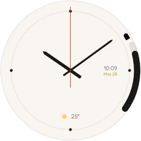
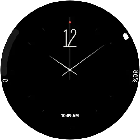
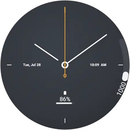
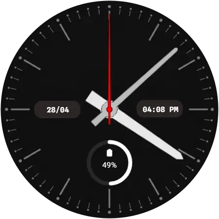
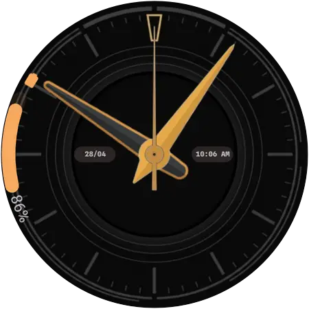
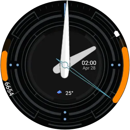
If none of those suits, the two categories to browse are minimalist — thin elements, restrained palettes, very little lit — and dark, which is deep backgrounds with a single accent doing the work. Both are full of designs that happen to be efficient because of how they look rather than as a feature.
Measuring it yourself
Battery claims are easy to make and hard to check, so here is how to check ours. Watch face power draw is small enough that a single day proves nothing — one long workout with GPS swamps a week of dial differences.
- Pick a normal week. Wear the watch as you always do, on one face, and note the battery percentage at the same time each evening.
- Change only the face. Same brightness, same always-on setting, same complications.
- Do a second week and compare the evening numbers.
- Then do the real experiment: leave the face alone and turn always-on display off for a week. That difference will be several times larger, and it will tell you which of the two decisions is worth your attention.
The result you should expect from the first experiment is a small, consistent difference in your favour, not a dramatic one — and if you do not see one, the dial was never your problem. That is a more useful thing to know than a claim we could have made instead.
Be sceptical of “battery saver” in a face’s name. There is no setting a watch face can switch on to save power, and no API for one. A face is efficient because of what it draws — dark, sparse, static — which is visible in the preview. If the preview is a bright animated dial, the name is marketing.
Questions
Does a black watch face really save battery on a Galaxy Watch?
Yes, but modestly. Galaxy Watch screens are OLED, so a black pixel is an unlit pixel that draws almost nothing. A dark, sparse dial therefore costs less than a bright, busy one — the difference is real and measurable, and it is a few per cent of a day rather than an extra day.
Does always-on display use a lot of battery?
It is the single largest dial-related cost, far bigger than the choice of face. The screen goes from being lit a few minutes an hour to being lit continuously. If battery life is the goal, turning always-on display off does more than any other change discussed here.
Do animated watch faces drain the battery faster?
Yes. Animation keeps the display refreshing and the processor working when the watch would otherwise be idle, and it is the one design choice that costs power even when you are not looking at the watch. A static face with the same colours is cheaper.
Do complications drain the battery?
Some do. A complication showing steps or battery reads something the watch already knows and costs almost nothing. One showing weather, or a continuous heart rate, causes real work — a network fetch or a sensor kept awake — and several of those on one dial add up.
What is the biggest drain on a Galaxy Watch battery?
Screen-on time, and after that GPS, LTE and continuous sensors. The watch face is a modifier on the first of those rather than a category of its own, which is why the honest claim for a good dial is a few per cent rather than a transformation.